Food Stamps Charts
These charts show the number of Americans receiving food stamps as reported by the United States Department of Agriculture. As of the latest data released on September 6, 2013, the total is 47.76 million, which is more than the entire populations of many large nations.
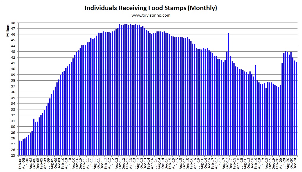
The first chart shows monthly totals over the last several years (click charts to enlarge):
The second chart shows annual totals back to 1975:

Since the year 2000, the annual total has only declined once, in 2007. (Note: The chart above is the average size of the food-stamp population over the year.)
The next chart shows the number of people added to the food-stamps program each month:

The jump in September 2012 was due to Hurricane Isaac.
The spike in May 2011 was due to a surge in Alabama after an historic onslaught of giant tornadoes devastated the state. According to the USDA’s report, about 1 million disaster victims from several states were added to the rolls.
The next chart compares our food-stamp population to the total populations of selected nations:

The next chart shows the percentage of Americans on food stamps (using FRED’s “POP” data series):

The next chart shows the monthly amount paid to recipients. Starting from $6.63 in 1969, the amount has risen steadily, primarily due to inflation. However, the amount dropped by 44 cents in 2012:

The next chart shows the total annual benefits paid out. At $74.6 billion in fiscal 2012, this is a major program:

A program with this many participants incurs huge administrative costs: $3.8 billion in 2012 – and that is only the federal government’s share. In addition, each state spends money to administer their end of the operation. The chart shows only federal expenses. Costs declined by $103 million in 2012:

The next chart shows the breakdown of participants by race (see table A.21 of this USDA report):

The next chart shows the number of individuals added to, or subtracted from, the food stamp rolls highlighted by presidential administration:

The next chart shows the numerical totals for each president. Keep in mind that not all presidents were in office for the same number of years:

Read more:
Notes
Note: The numbers for Presidents Bush (43) and Obama are higher than they otherwise would have been because the government started to use food stamps for disaster relief starting in 2005 for Hurricane Katrina. See this PDF document for those numbers.
Note: The annual totals used above are based on the federal government’s fiscal year, which begins in October.
Note: States are allowed to deny food stamps to convicted felons. Different states have different policies, however it doesn’t effect their expenditures either way since the USDA pays for all food stamps.
Note: The USDA reports monthly food-stamp data with a two-month delay.
Note: The March 2012 numbers are slightly elevated due to disaster relief for windstorms that occurred in February and March 2012. However, the USDA did not give exact numbers, possibly because “congregate feeding” methods were used. See their statement here.
Note: The Obama Administration loosened the ABAWD (able-bodied adults without dependents) requirements. So, that accounts for a small portion of the increase in food-stamp usage. This action was similar to extending unemployment benefits due to the poor job market. See this report from the Congressional Research Service for more information.
Note: See this page for the history of the food-stamp/SNAP program.
Note to bloggers: You may use any of the charts on this page on your blog as long as you include a link to this page. No hot-linking please.
The USDA releases updated food-stamp data each month.
Last update: September 6, 2013
Next update: October 4, 2013